Version 4.2.0
Optimised user interface
Forms, colours and buttons have been revised with fabUI – for a calmer, more modern and clearer interface.

Forms, colours and buttons have been revised with fabUI – for a calmer, more modern and clearer interface.
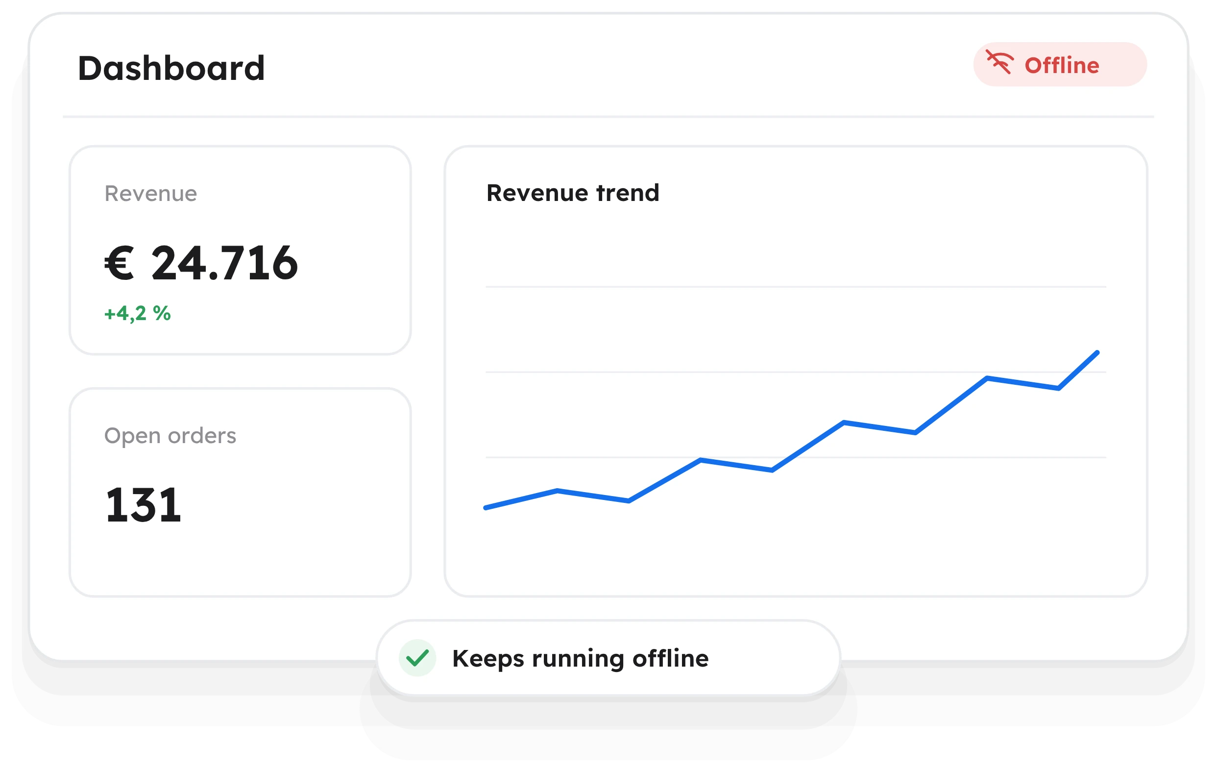
At first glance the differences are subtle, but you notice them in daily work. Screens such as the partner page look calmer and more clearly structured: fields, tabs and actions are more clearly separated, buttons are designed consistently, and important actions stand out visibly.
Because all elements are based on the same design system, fabular looks consistent everywhere. This makes it easier to find your way around, especially for new users, and lays the foundation for further improvements in upcoming releases.
The new interface is active automatically. You do not need to set anything up or relearn anything: you will find all screens and functions in the usual place, just in the new look.